Where the action is
There was an interesting essay in the New York Times over the weekend by a couple of doctors, one of whom is right here in Portland. Their point was that in the present landscape of the Covid pandemic, it makes more sense to look at hospitalization numbers than at positive test numbers. With vaccines widely available in this country, and oral treatments in the wings, there should be more and more cases coming along that aren't deadly serious.
Some policymakers may be wary of not using case numbers as the primary metric to guide public behavior and policy. As cases become more complex, however, health departments should still monitor infection numbers, but guidance should be tied to hospitalization metrics. When rising cases do not reliably predict hospitalization surges, hitching Covid policies to cases alone is no longer effective policy — or good public health.
As readers here know, I've always considered hospitalization figures more meaningful than new case numbers. New case figures depend on frequency of testing, and that's not a constant.
Anyway, here are the hospitalization and intensive care curves for Oregon to date. As you can see, we are better off than we were at this time last year, when the winter surge was at its worst. But we've kind of flattened out lately, and we've been in better shape than we are now for a lot of the ordeal. Before late summer 2021 sent our numbers through the roof, that is.
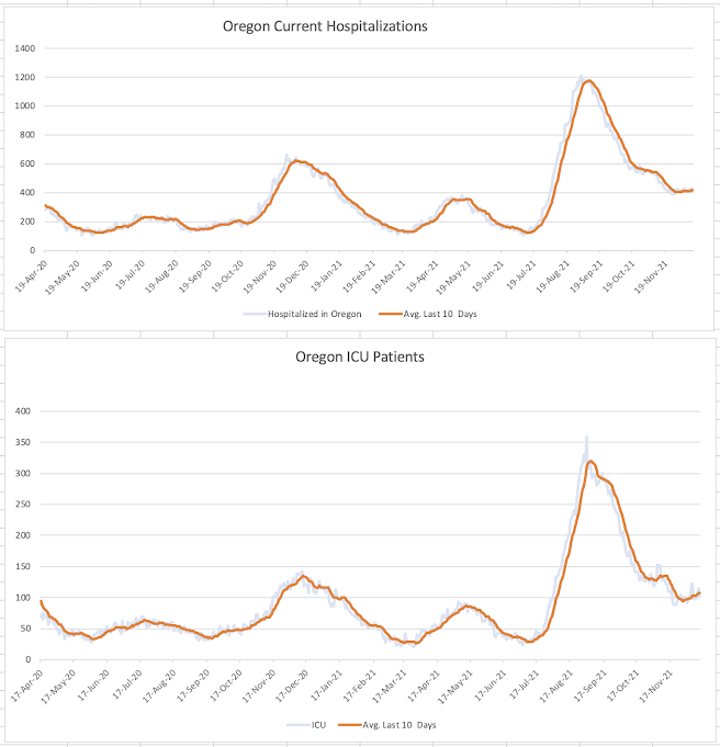
Let's hope that these curves resume heading downward again soon. It's a grim fact that 1 out of every 100 Americans over the age of 65 has died from this thing.
Jack, every time you post these graphs, I go looking for them here, but can’t find them:
ReplyDeletehttps://public.tableau.com/app/profile/oregon.health.authority.covid.19/viz/OregonsCOVID-19DataDashboards-TableofContents/TableofContentsStatewide
Where can I find them?
I create them myself using the data that the OHA releases every weekday. They have something close on their website, but I don't trust them to tell me what I want to know, or to keep the data accessible. I can send you my whole Excel file if you email me.
DeleteThanks for letting me know. I usually consider myself fairly adept at navigating websites, and hadn’t considered that you created the graphs from OHA data. I’ll let you continue with the heavy lifting, and thanks for doing so!
ReplyDeleteSeattle's Omicron changeover is 5 days behind London. I think OHA was whistling past the graveyard in discounting the Omicron cases in their survey last week. The saving grace is Omicron looks less infectious to alveoli, more infectious to bronchial tubes ... so maybe less servere. Watch the Brits and the Danes for best preview of the shape of things to come.
ReplyDelete